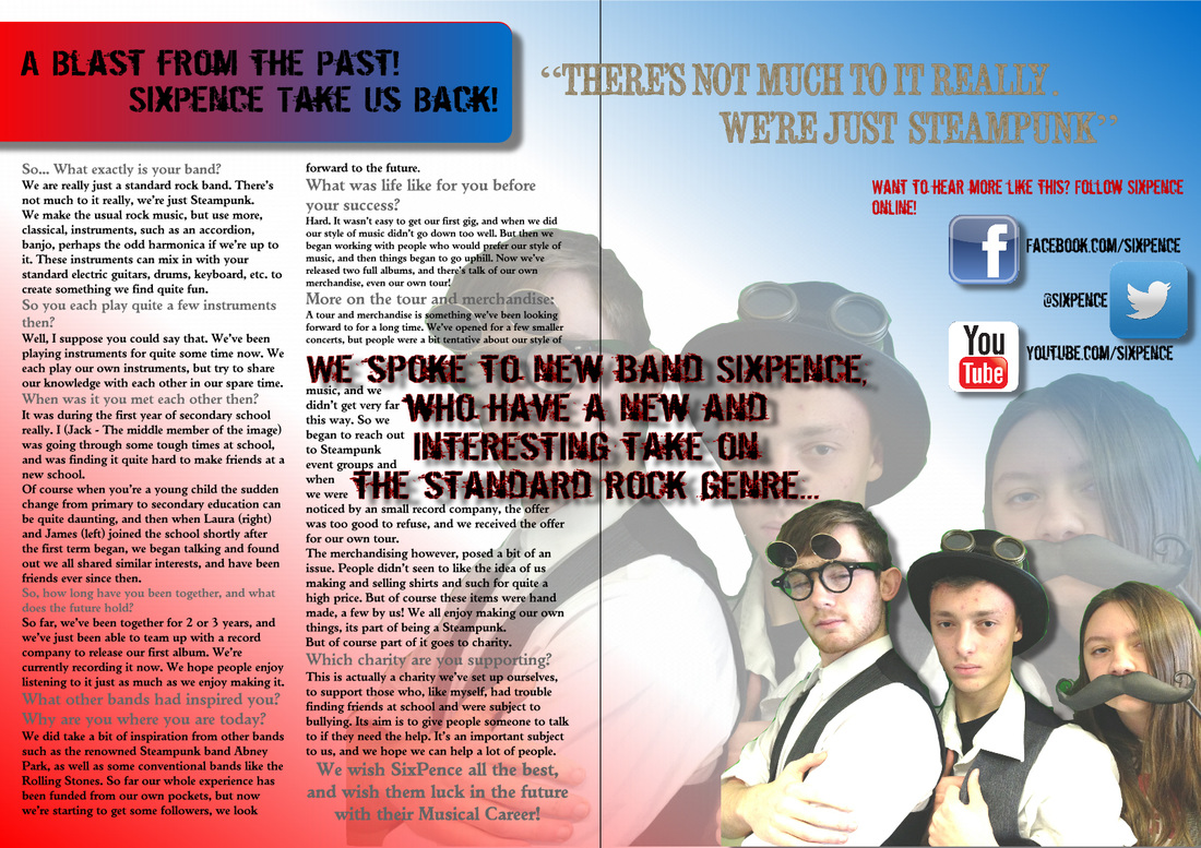
| "The grey text is quite hard to read..." "There are patches of green screen in the main image" "The social media icons would look better in a list." A Review from Laura: "They grey and gold text is sometimes difficult to read because of the change in background colour. The picture is very clear and well edited the article does show personality, but does not have a lot on the music of the individuals rather than just comparison to other bands. "The right page seems a little empty with the icons emphasising it as they are unnecessarily big, the quote should have been larger rather than the contacts as a kind of headline to draw you into the page in summary." The page is good overall, with plenty of information, good photo editing and very vibrant, but colours do not always compliment and often fade against one another." | 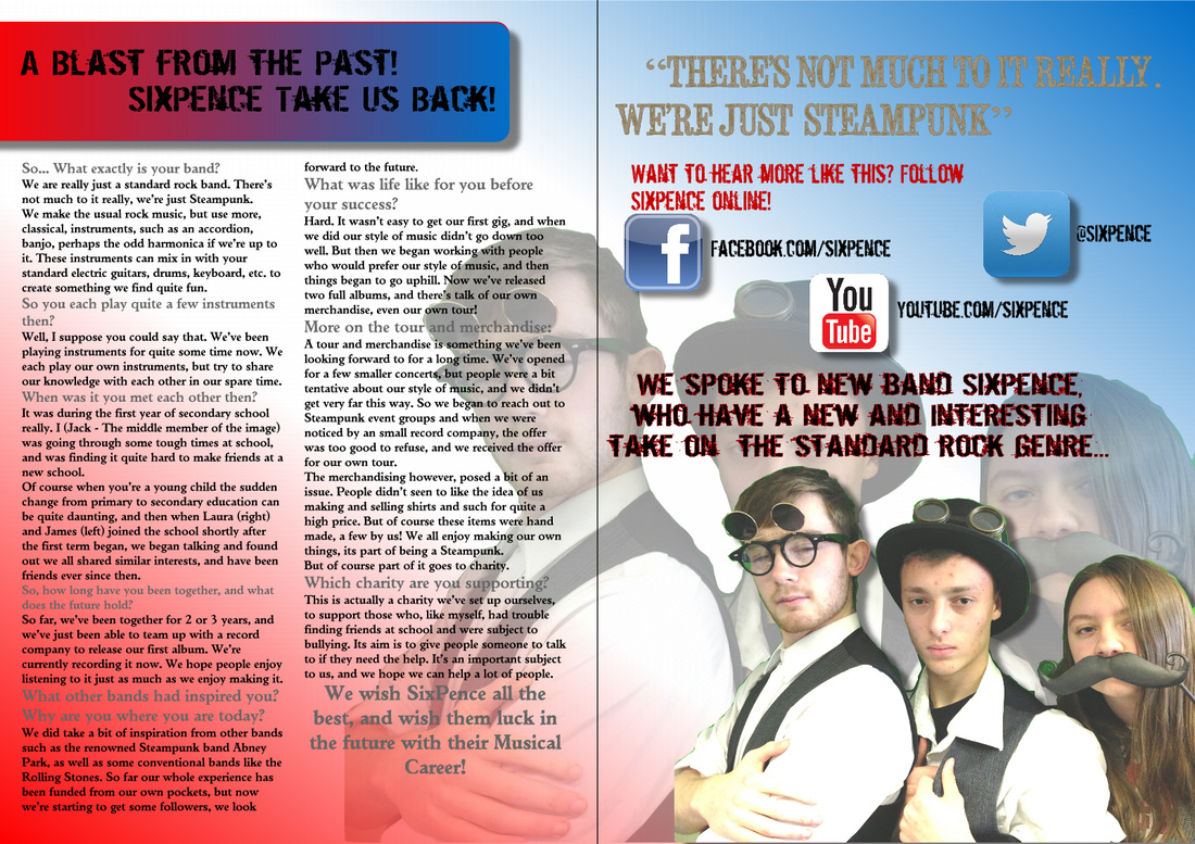 |
|
0 Comments
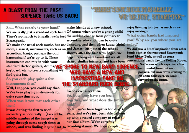
 Once again I present you with another mighty find double page spread. Following the sugg
Aren't these double page spread's looking similar? Not in the slightest, but mine's starting to look more professional!
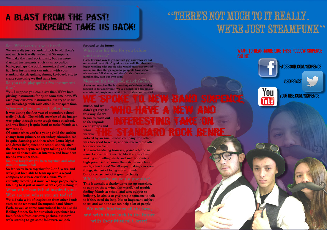
The interview is finally on its own page as is the main image, much like Q magazine. The layout and formatting of the text is easier to read, like Q magazine's too.
1. Edit page layout - Change the page so interview doesn't spread to both pages, or cover images, etc.
2. Change red text and gold text to make them more readable. 3. Consider background recolour.
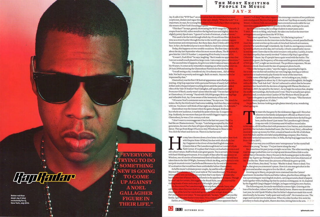
My magazine is really coming together, don't you think? Once again next to Q's DPS, I have a much clearer image this time, although the image for Q magazine is much larger... Perhaps something to change? The interview now covers both of the pages and appears to include much more content, but that is a problem as the interview would be creased along with the fold of the page, which is something I will have to rethink...
|