
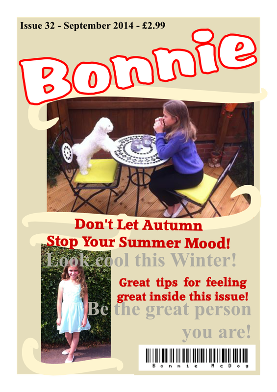
As this is my first magazine, I don’t think this is a bad attempt, however there is a lot of things I would change to make it more suited to a fashion magazine.
For example, the layout does not necessarily present as a fashion magazine. If the smaller image were to be used as the whole magazine, it would probably present the theme of a fashion magazine better. It should also give more examples of what is featured inside the magazine, and give more images as an example, which is a typical magazine convention and as my magazine does not use many traditional magazine conventions, it looks more like a poster. |
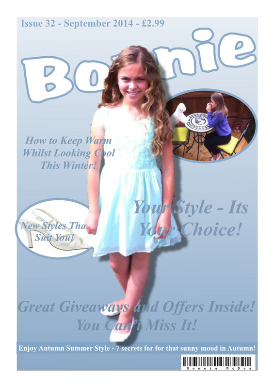
The second attempt I think it much better. It looks more like a magazine than a poster. The colour scheme is much more stylish and professional, whereas the original magazine was more blocky and dull. This time the pictures are placed much better, and the magazine has a main image, and more magazine conventions relevant to the theme. |

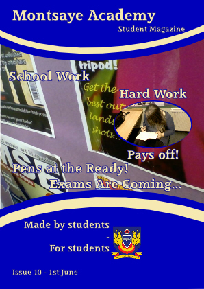
Here is my first attempt at a school magazine. I think the front cover has turned out quite well. It contains relevant images that match the various cover lines advertising the magazine’s articles and stories.
There are, however, a few things I would change: First of all this is a “Student Magazine,” and the layout seems more professional or serious, which does not reach the target audience of young students. However the colour scheme is bright and (quite) colourful, which does apply to the target audience. Secondly, I would probably add more to the magazine’s front cover (for example, more cover lines and hot spots), in order to follow the Rule of Third to equalise the magazine. I did not include things like a price and a barcode, as these would not be necessary on a school magazine. |
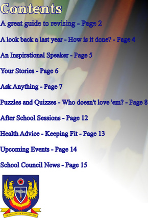
Here is the contents page. I like this page a lot. The background image is relevant to the target audience and presents a lot of colour to the page.
Perhaps next time I would add a few more images to add more to the contents page and add interest. |
Here are 3 other logos I developed using parts from the original. I think these would be a better logo to use as they don't take up too much space and would be easier to use.

|
|
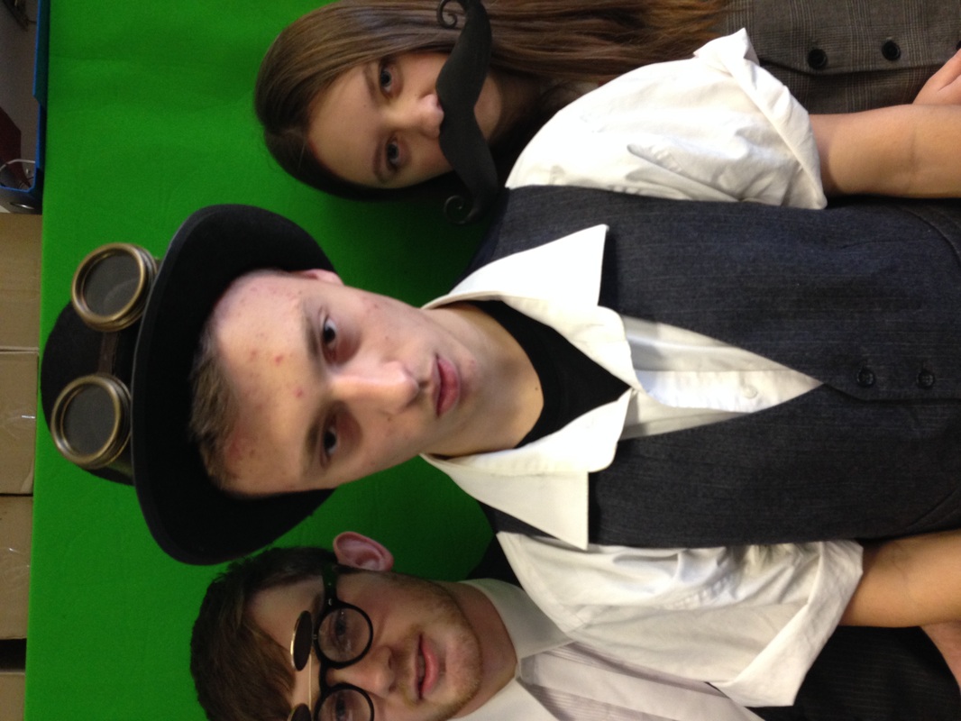
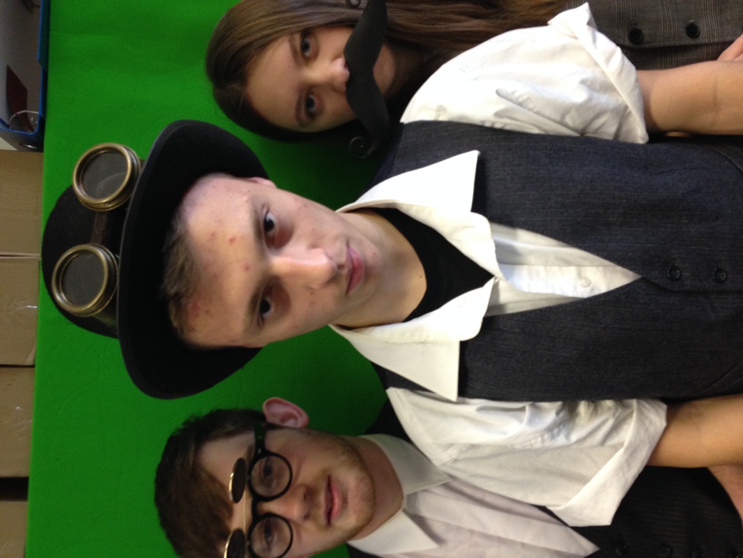
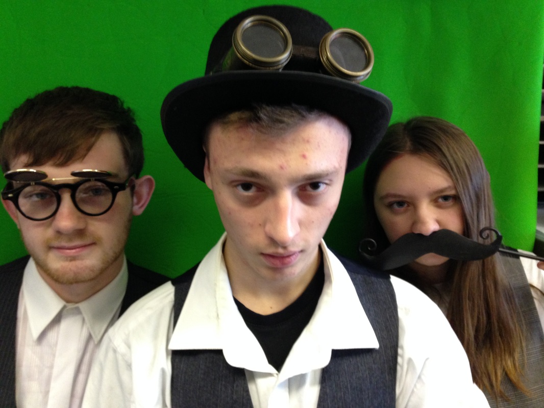
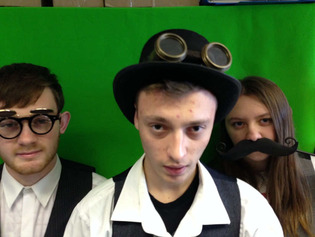
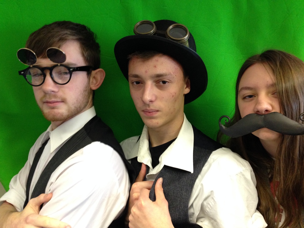
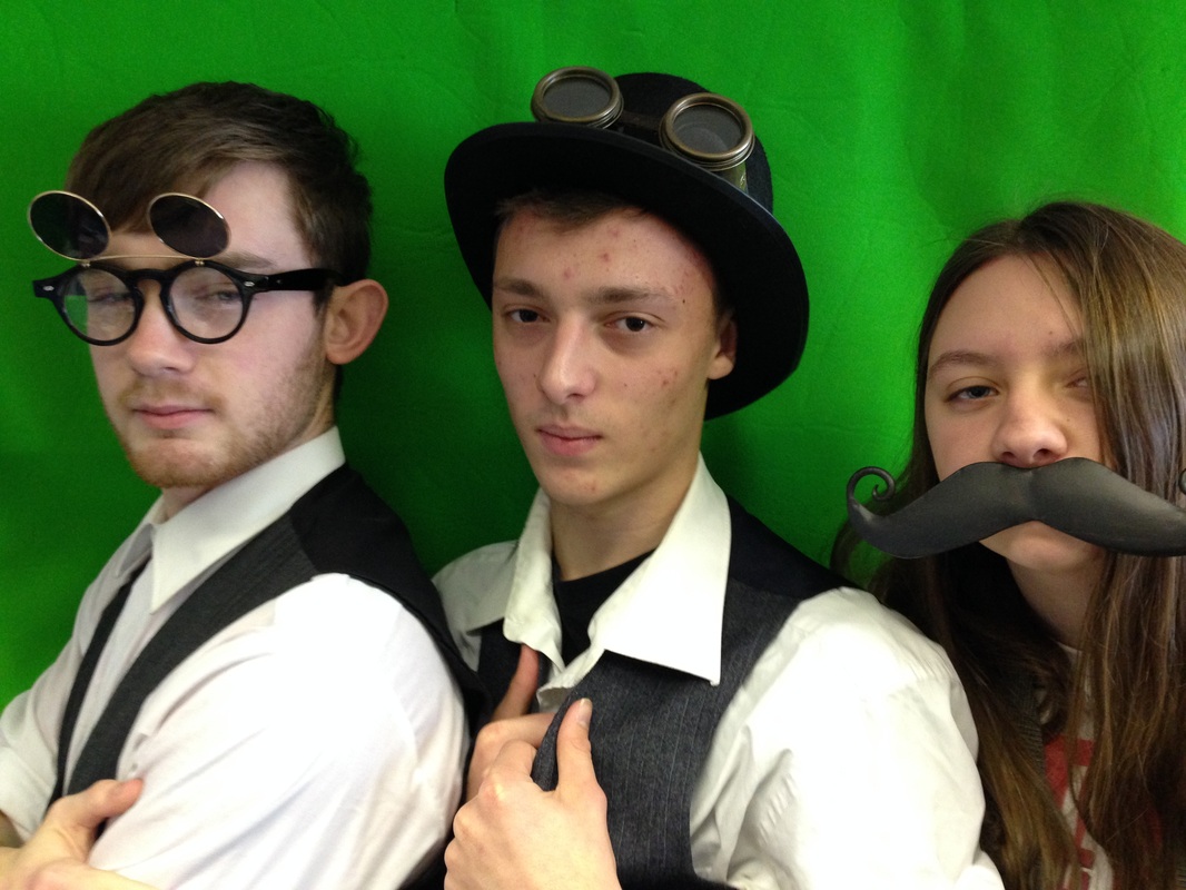
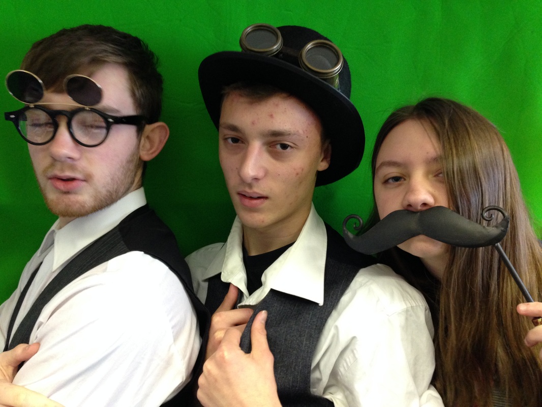
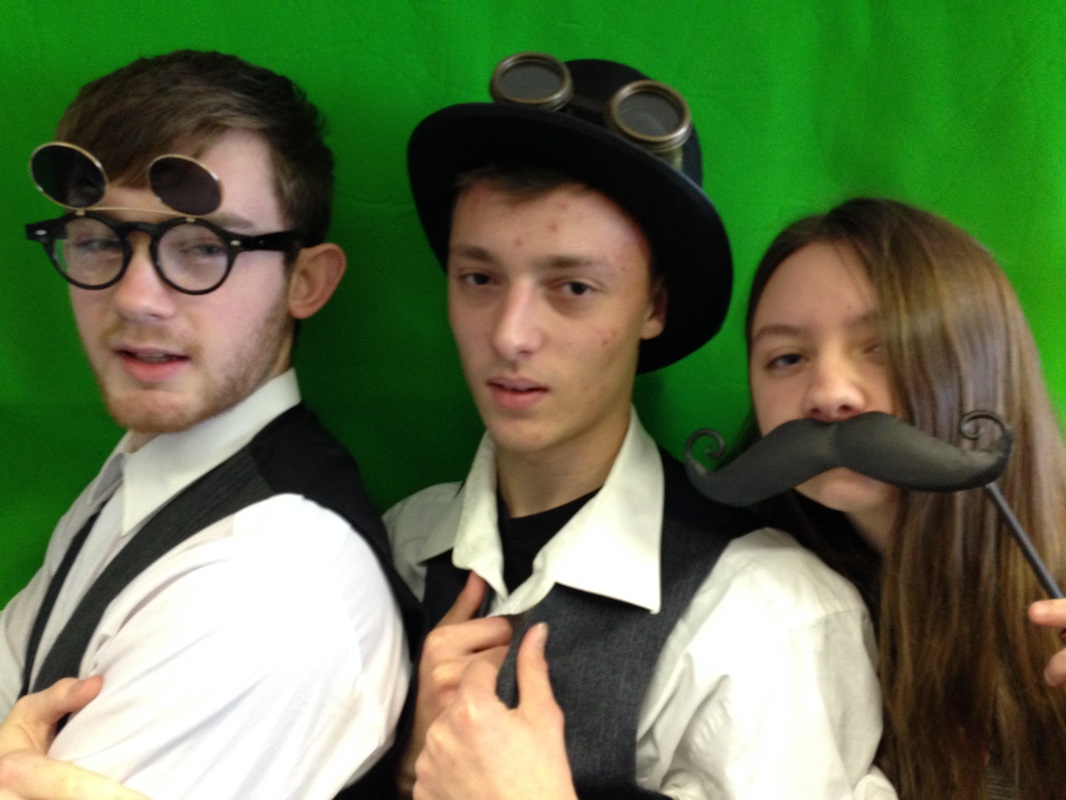
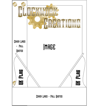
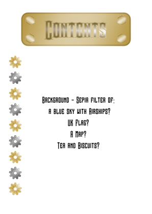
Here are the two plans for my music magazines. They present my ideas for decoration and the layout of my magazine. Some aspects may not present this as a typical magazine, but Steampunk isn't usually a typical magazine genre, so I have added in a few new ideas. The background for the contents page is something I need to decide on. I will probably ask the target audience what they would think would suit it well.